Interactive demo
Below is an interactive recreation of the Palm OS 5.2.1 Memo Pad application (version 1.1 released in 2003) that I created in React. As I dig into the UX of Memo Pad, you can follow along and experience it for yourself!
Memo Pad
In 1996, Palm Computing, Inc designed Palm OS for the Pilot 1000 and 5000 PDAs. As part of that release, one of the best scratchpad text editors ever created was unleashed upon the world: Memo Pad.
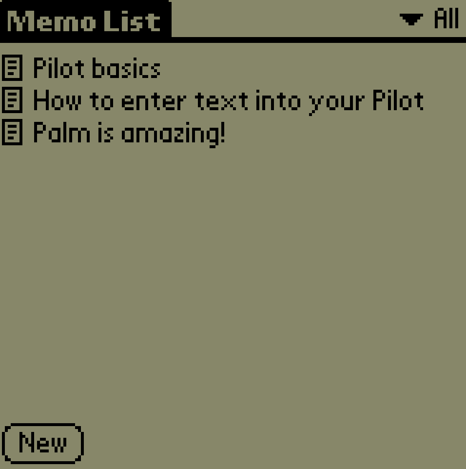
Memo Pad was one of five PIM (personal information management) applications included with OS 1.0. Memo Pad was simple, fast and designed to be as frictionless as possible. With the press of a physical button, the user could access their memos in under a second. While Memo Pad saw (minor) updates through the 8 year lifespan of Palm OS, the core experience remained the same.
UX thrives in the details
User experience lives and dies in the details. The best user experience (UX) is achieved through the seamless and nearly invisible combination of numerous micro-interactions. To succeed, it’s important to consider the target audience, host technology and situational usage. Getting any one of these points wrong leads to micro-interactions that go against the best intentions of the user. In isolation, they may go unnoticed, but after a few misses the user becomes frustrated.
Let’s dig into the considerations that went into Memo Pad!
Design for the hardware
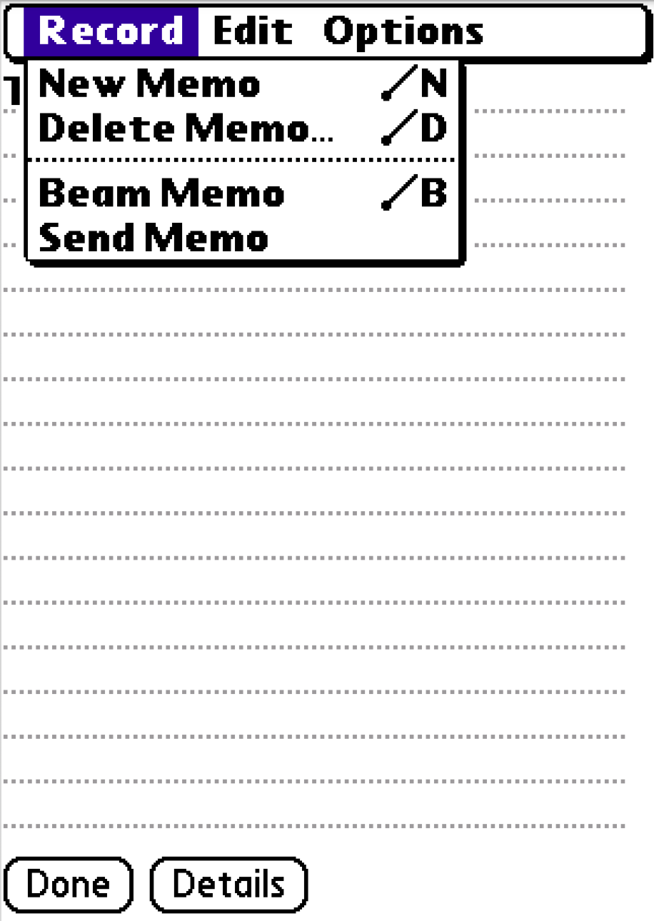
Palm OS devices feature a number of physical buttons to quickly launch certain applications. The creators of Memo Pad took this into consideration in two key ways.
First, Memo Pad loads instantly (as do many Palm OS applications). Clicking the physical Memo Pad button results in your list of memos being displayed in milliseconds. No loading, internet connection or data syncing.
Physical buttons come with an expectation of responsiveness. You press “Volume Up” on your keyboard and expect to immediately see an indicator of the action. The same is true with those on a Palm Pilot, you press Calendar or Memo Pad and expect instantaneous feedback.
Secondly, the designers at Palm further leveraged the Memo Pad button to iteratively drill down the displayed data. When the application launches, all memos are displayed. Clicking the button again applies the first category filter, and each subsequent click continues down the category list.
One might wonder why your second click of the button cycles categories rather than create a new memo. While I can’t state a verified claim, I can make an educated guess.
Palm OS devices featured resistive touch screens, requiring the use of a stylus for any accuracy. Imagine the interactive demo at the top of the page is running on a Palm OS device in your hand. If you wanted to write a new memo, you’d have already pulled out the stylus in preparation of writing in Graffiti. On the other hand, if your goal was to simply read a memo in the “Personal” category, you’d have to pull out the stylus, tap the select list, tap the category, and put the stylus away. The physical button shortcuts this.
This physical UX is a common pattern across Palm OS PIM applications. For example, the calendar button cycles between week/month/agenda views in the Calendar application, each button click funnels the data.
Reduce cognitive load
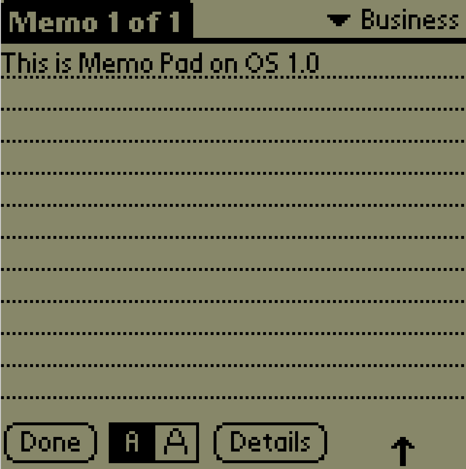
In the interactive demo, press “New”, type a few letters, then click “Done”. You’ll notice the memo automatically sets a title. Try the same process, but add a blank line before you type anything. This time, Memo Pad ignored the blank line and instead used the first line of content for the title.
Now try this, press “New” and then immediately press “Done”. You’ll notice that Memo Pad does not persist a blank memo.
These micro interactions are nearly invisible patterns that predict how a user would expect the application to work. Imagine you went to create a memo, changed your mind and backed out but instead of being discarded, a new blank memo greeted you. It would be a frustrating experience, requiring you to open the blank memo, click “Details” and click “Delete” to clean up.
It’s worth calling out that Memo Pad does not rely on manual saving of records. The above interaction patterns enable Memo Pad to intuitively save or discard memos without user input. For 1996, this was a big deal when your target demographic were busy professionals walking to their next meeting.
Simple but flexible
While you interact with the demo, you’ll notice there’s little in terms of customization in Memo Pad. You write memos, categorize them and view them. Memo Pad gets out of your way and is tailored to a specific use case: recording small pieces of text. The application is not the best choice for jotting down a phone number while talking to a business associate, that’s best left to the Note Pad application. Nor is it for writing a 10 page TPS report (Memo Pad has a 4,000 character limit).
To that end, Memo pad didn’t include features such as spell check or formatting. In a way, it follows the Unix philosophy of sharp, purpose-built “scalpels” over bloated “Swiss Army knives”.
Consistency
While Memo Pad is simple, it manages to follow the norms and established patterns of the platform. The categorization system provides just enough for users to separate work and personal records, identical to nearly every other Palm OS PIM application. Memos can be beamed and marked private. A menu option allows one to cross reference the Contacts application to insert a phone number.
Staying consistent with established patterns grounds the user. They know what to expect and feel comfortable using the application. The application feels like a familiar tool in your toolbox.
Other interactions worth noting
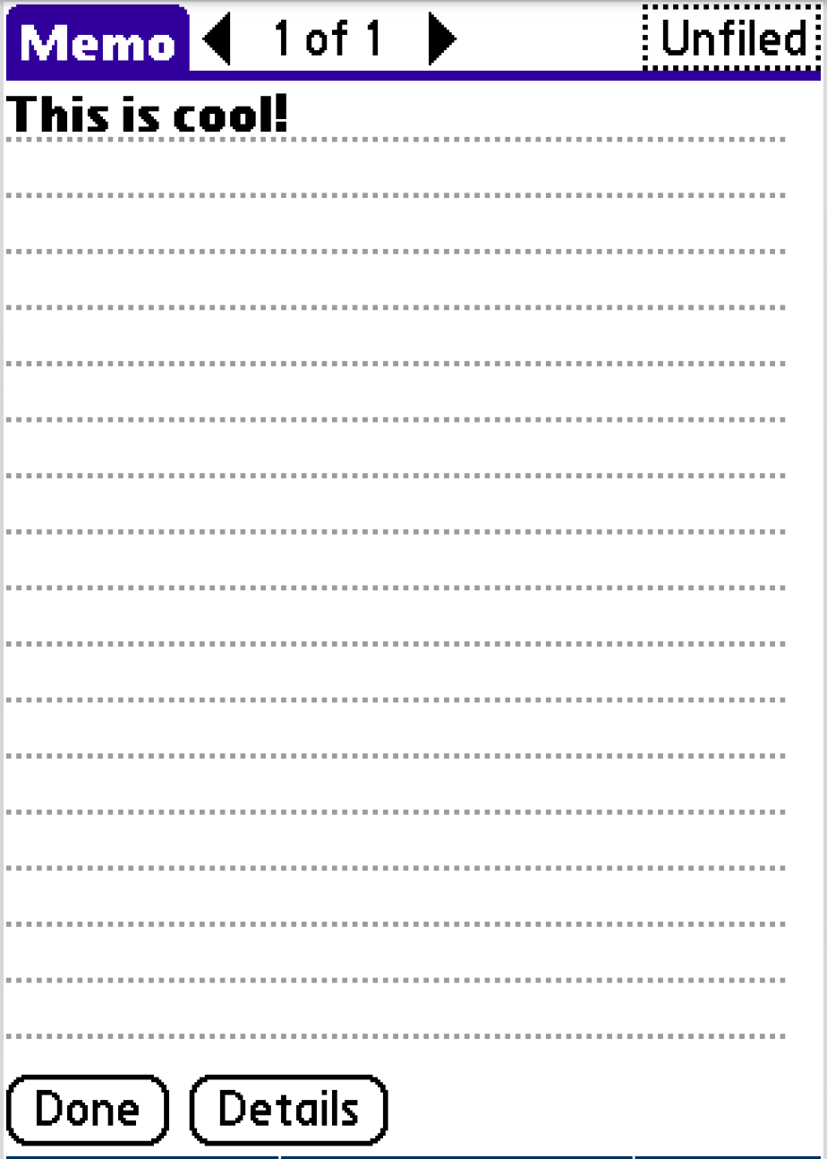
The arrows that show on the menu editor screen (you can see them in the demo) were added after the OS 1.0 version. They allow you to quickly jump between memos without the extra step of returning to the list screen. Additionally, the arrows are category aware when filtered from the list screen. For example, if you apply the “Personal” filter on the list screen and open a memo, the arrows will navigate between other memos categorized as “Personal”.
Speaking of categories, the distinction of “All” and “Unfiled” is interesting. It’s a rare pattern not often repeated. For example, neither Apple Notes nor Apple Reminders let you filter to records that do not have a category assigned, the best you can do is the “All” view. Additionally, the verbiage of “Unfiled” versus “Uncategorized” is skeuomorphic in nature, it bridges the gap with an office filling cabinet. Design for those that will be using your software!
Be like Memo Pad
I know what you’re thinking: “this guy sure loves Palm Pilots”. And yeah, I do, but there’s more to be gained here! When I compare Memo Pad to Apple Notes or Google Keep, it feels like modern applications have missed the mark. Both are filled with features to an overwhelming level. Apple Notes has the same suite of editing features on mobile as it does desktop. The concept of designing for the environment and platform are seemingly absent. An application that should tailor to jotting down snips of text while on the go has the feature set of a full word processor.
All this to say, I love software that embraces simplicity and focuses on doing one thing well. When you design for the user, the situation and the device, you get a timeless application.